
Good Design Speaks For Itself, And These A’ Design Award Winners Say It Best
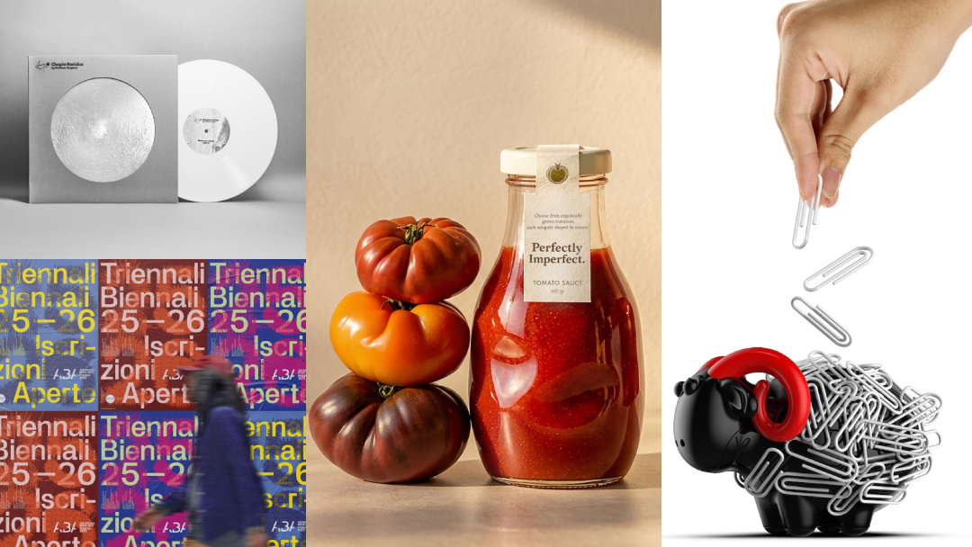
Good design has plenty to say, and sometimes, the most memorable messages need only a few words. From clever visual identities and striking typography to imaginative advertising campaigns and illustrations, communication design has a way of turning ideas into something people can instantly recognize, understand, and remember. Celebrating this creative thinking is the A’ Design Award and Competition, an international program that recognizes outstanding work across a wide range of creative disciplines. Bringing together designers, studios, agencies, and brands from around the world, the competition provides a platform for projects that demonstrate originality, thoughtful execution, and effective design.
Among its many areas of recognition is the Good Communication Design Award, which puts the spotlight on the art of getting a message across. Whether through branding, graphic design, packaging, visual storytelling, or other forms of creative communication, the category celebrates work that makes an impression while serving a clear purpose.
With entries open for the next edition, designers and creative teams have until February 28, 2027, to submit their work, with winners scheduled to be announced by DesignTAXI on May 1, 2027. Those interested in putting their own projects forward can register today.
For a little inspiration, we’ve rounded up a selection of past A’ Design Award winners that show how creative communication can take many different forms. Take a look at the projects that caught the jury’s attention.
Perfectly Imperfect Sauce Bottle by GCA Design Studio
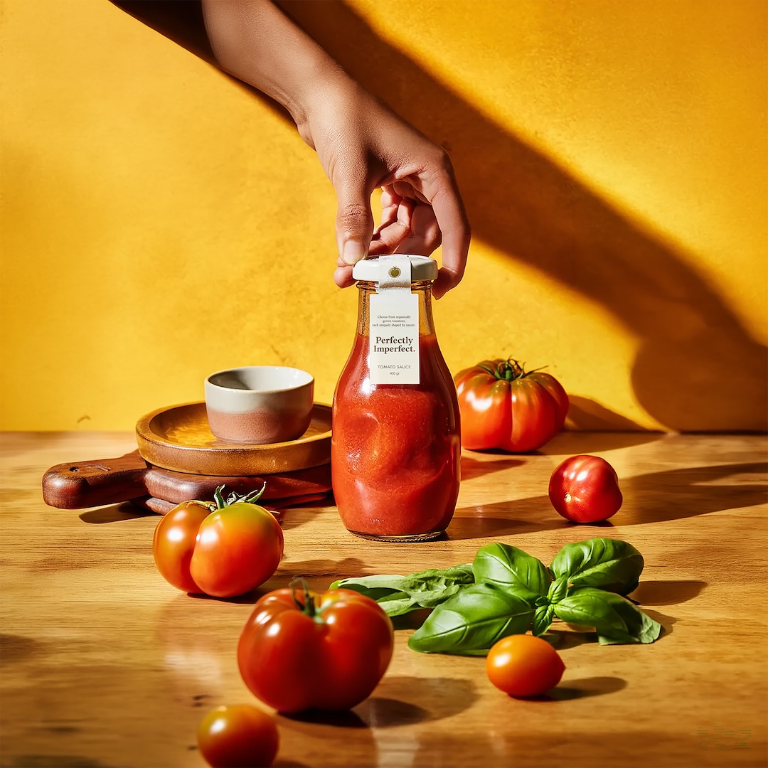
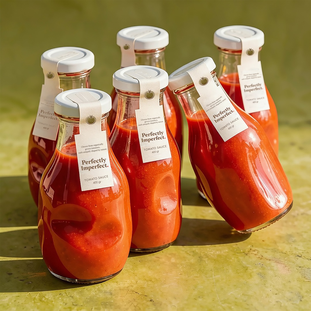
Not every tomato grows into a perfectly round specimen, and GCA Design Studio sees no reason why its packaging should either. Taking cues from the irregular shapes of organic tomatoes, the Perfectly Imperfect Sauce Bottle brings a little of nature’s unpredictability to mass-produced glass packaging. Rather than treating slight differences in shape as flaws, the design makes them part of the bottle’s identity.
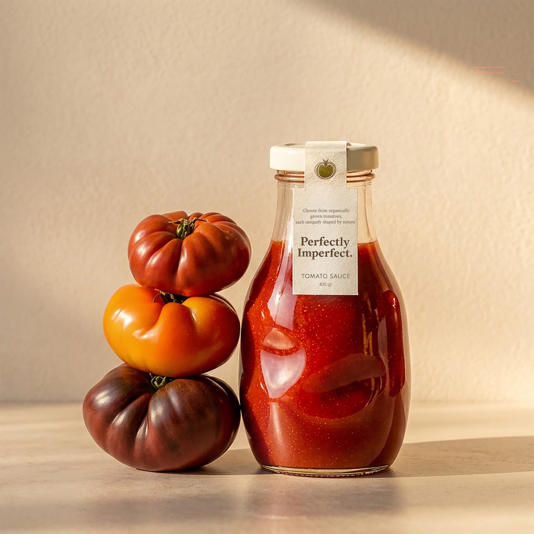
Perfectly Imperfect Sauce Bottle by GCA Design Studio
Each clear glass bottle follows the same basic structure but allows for subtle variations in its form, giving individual bottles slightly different appearances. These controlled irregularities can also help reduce manufacturing waste by limiting the number of bottles rejected and remelted over minor imperfections.
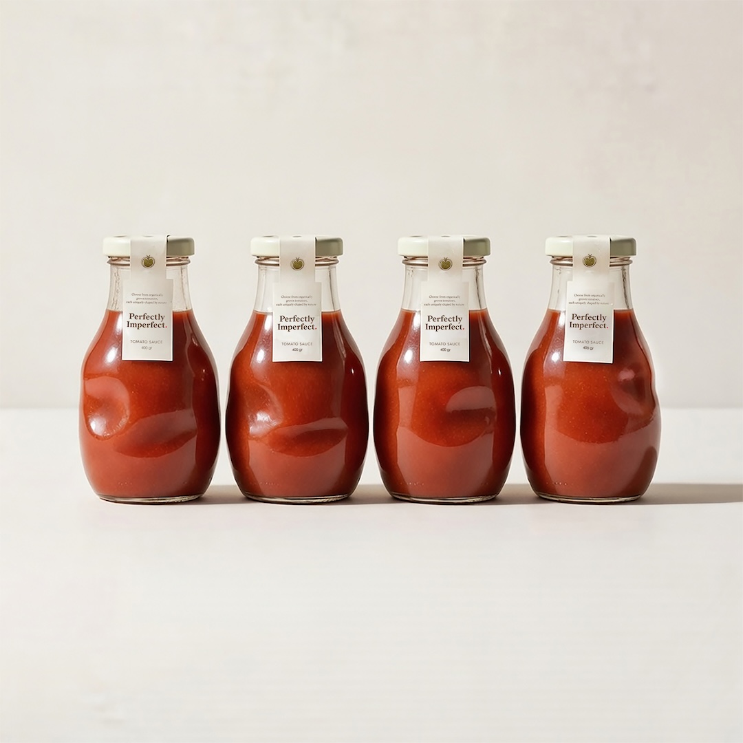
Perfectly Imperfect Sauce Bottle by GCA Design Studio
On the shelf, the variations invite shoppers to pick the bottle that catches their eye, much like choosing fresh produce at a market.
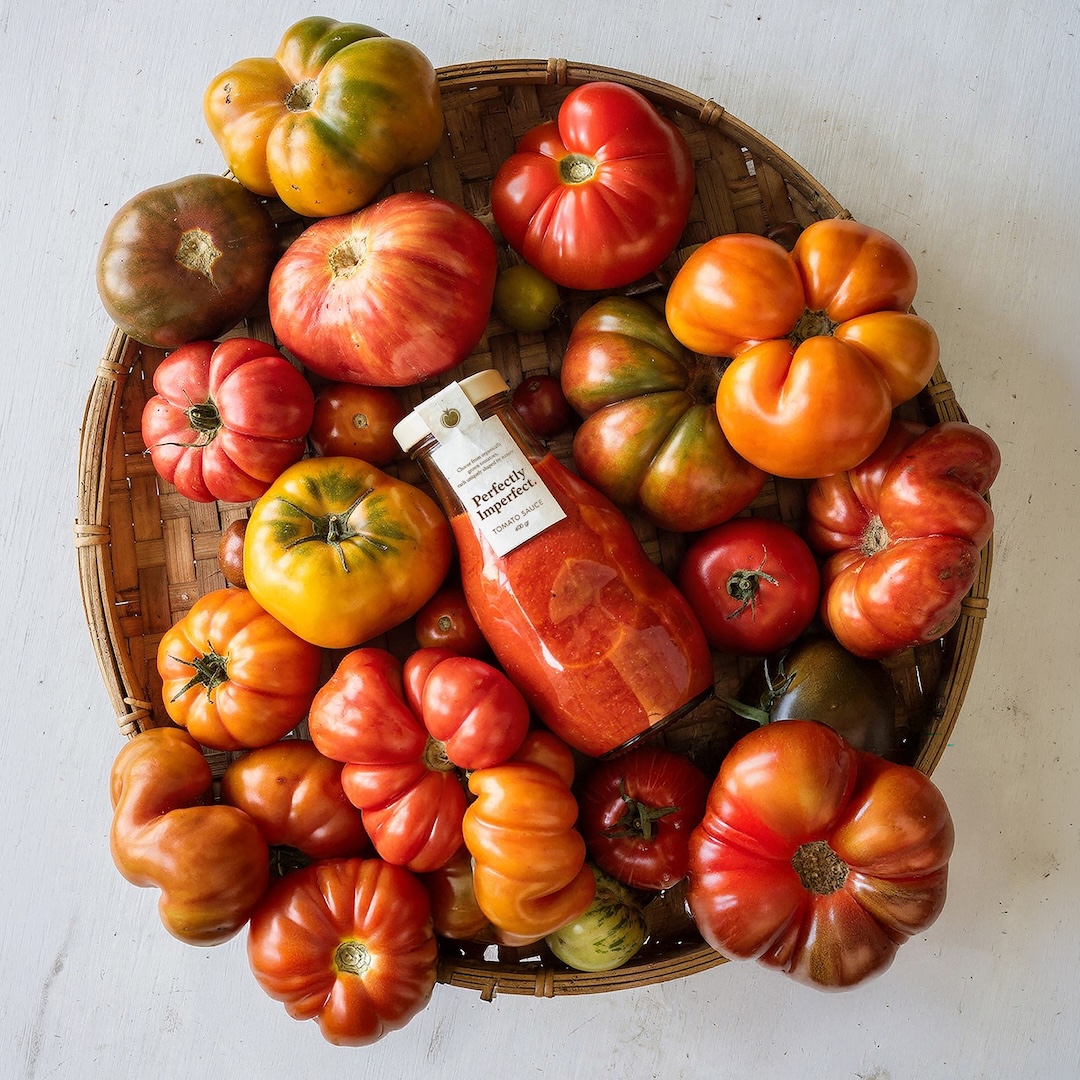
Perfectly Imperfect Sauce Bottle by GCA Design Studio
Perfectly Imperfect Sauce Bottle by GCA Design Studio
Perfectly Imperfect Sauce Bottle by GCA Design Studio
Stolen Moments Incense Brand by Yerong Chen
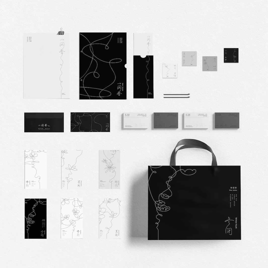
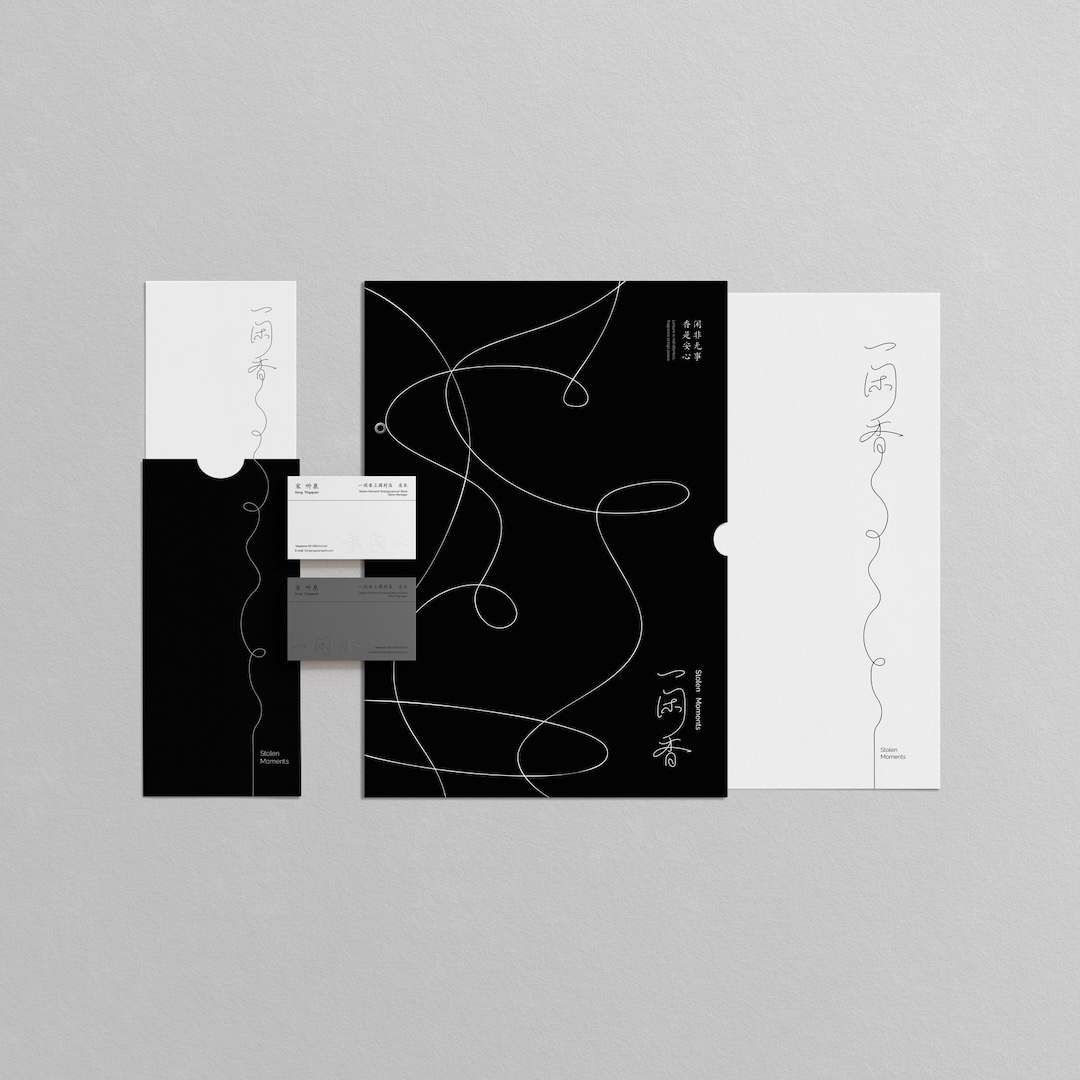
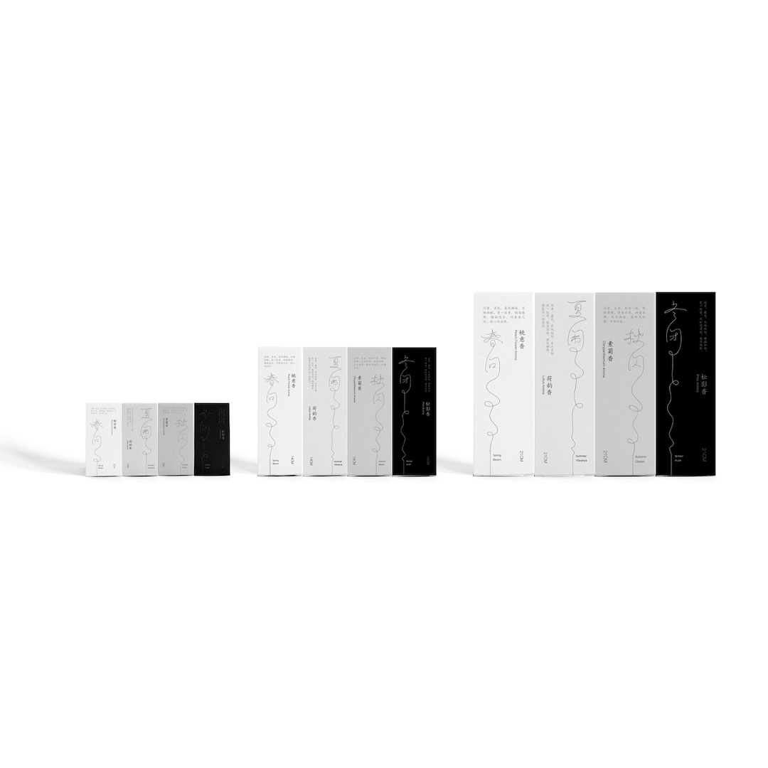
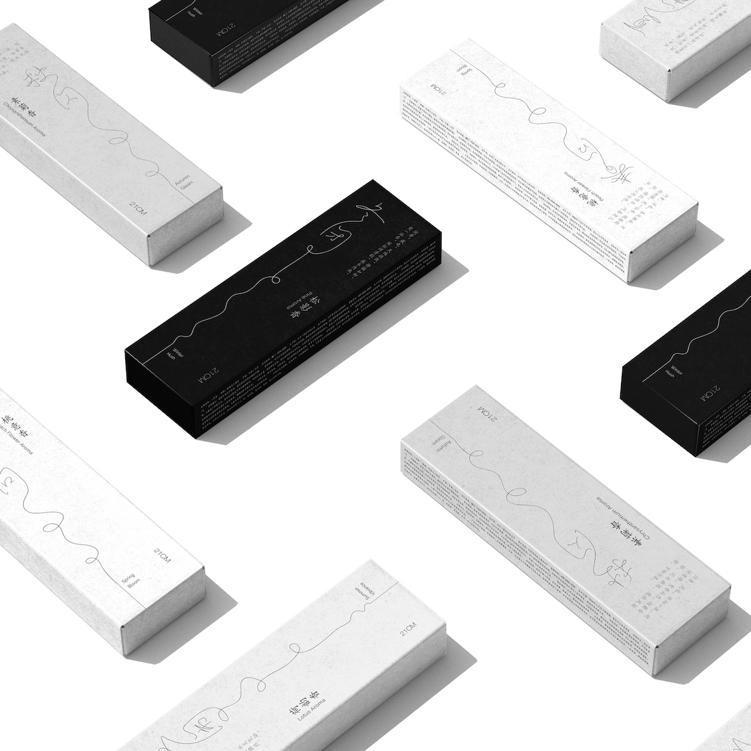
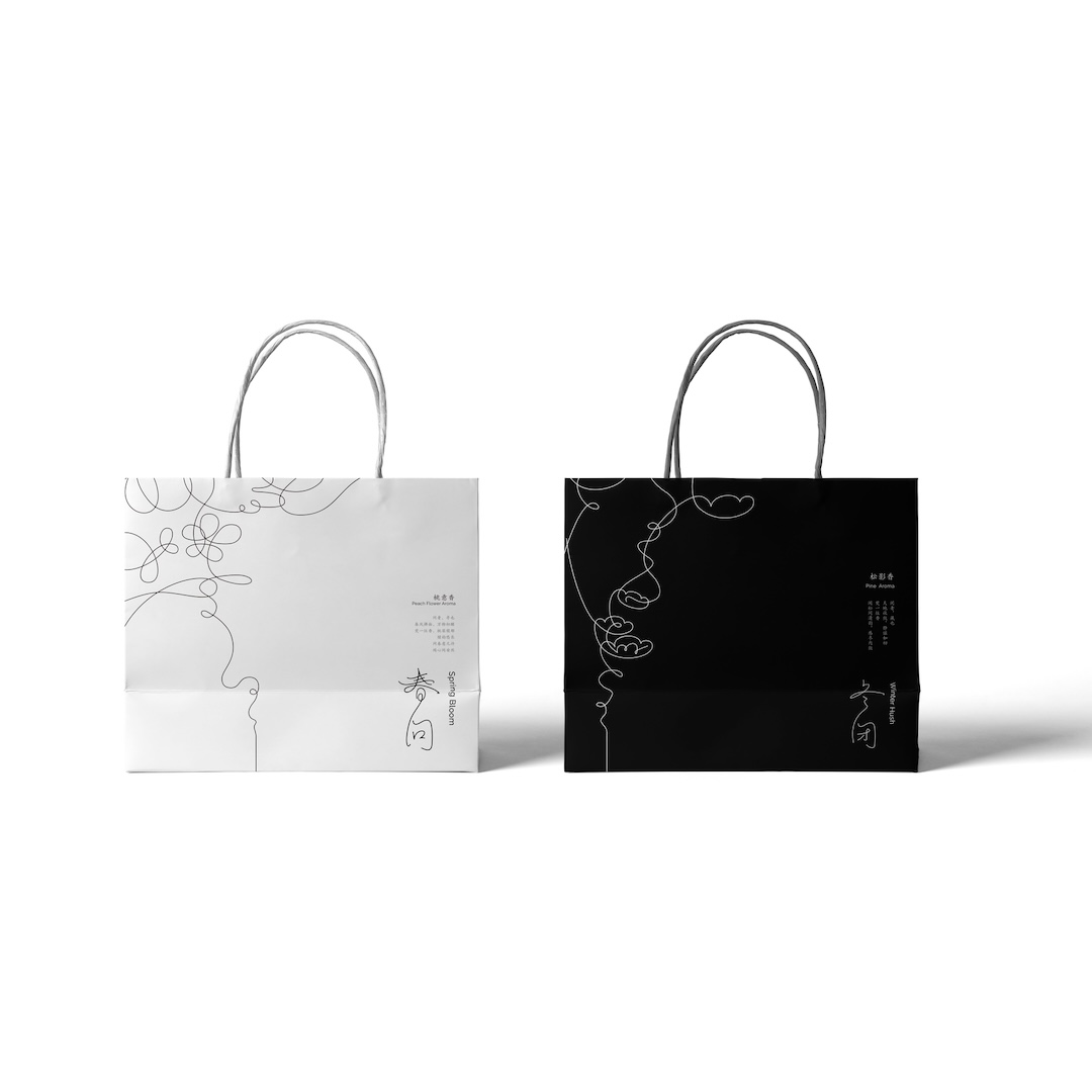
Finding a moment of peace can be easier said than done, but Stolen Moments makes the act of slowing down part of its design. Created by Yerong Chen, the incense brand draws from the Eastern philosophy of Qi and the delicate, flowing strokes of Song Dynasty calligraphy. Its packaging features a continuous, winding line inspired by drifting incense smoke, giving the visual identity a quiet sense of movement.
Stolen Moments Incense Brand by Yerong Chen
The collection includes four seasonal fragrances, with incense sticks available in different lengths depending on how much time users want to set aside. A shorter stick might accompany a quick break, while a longer one suits a more extended period of reflection. By connecting the duration of burning incense with the idea of taking time for oneself, the design turns an everyday ritual into a gentle reminder to slow things down.
Stolen Moments Incense Brand by Yerong Chen
Stolen Moments Incense Brand by Yerong Chen
Stolen Moments Incense Brand by Yerong Chen
Stolen Moments Incense Brand by Yerong Chen
Shearing Magnetic Absorption by Xin Se
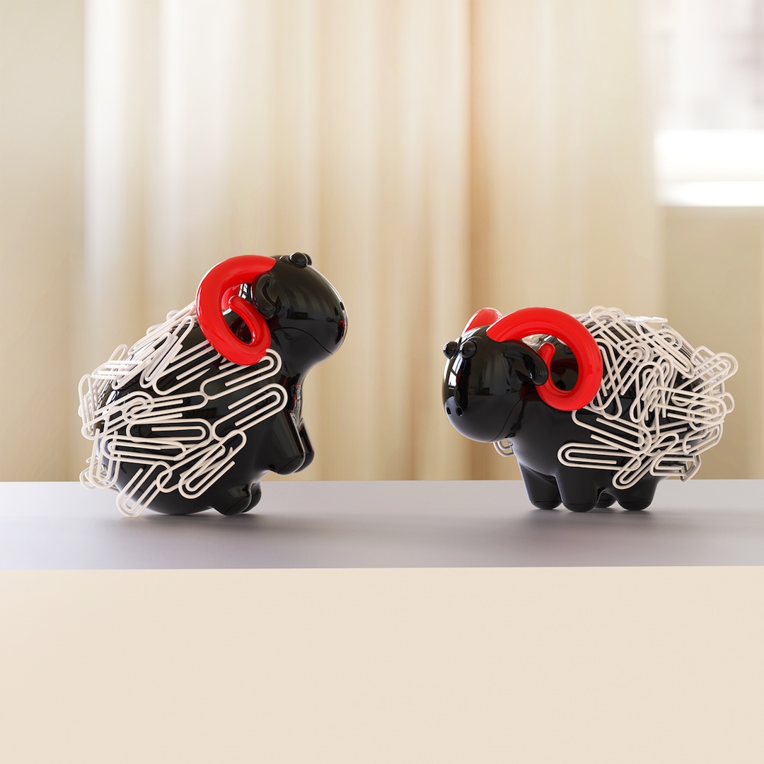
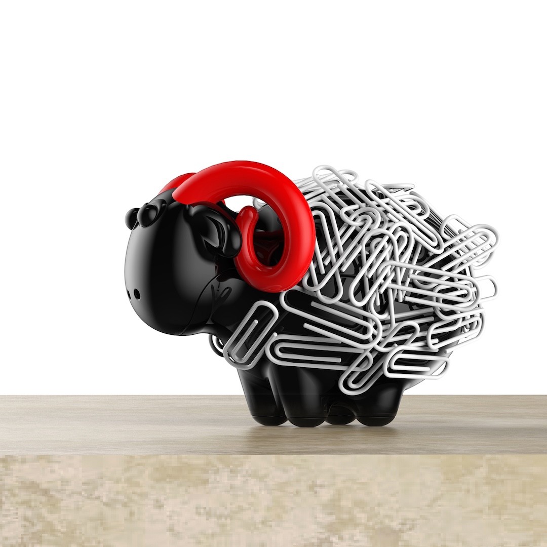
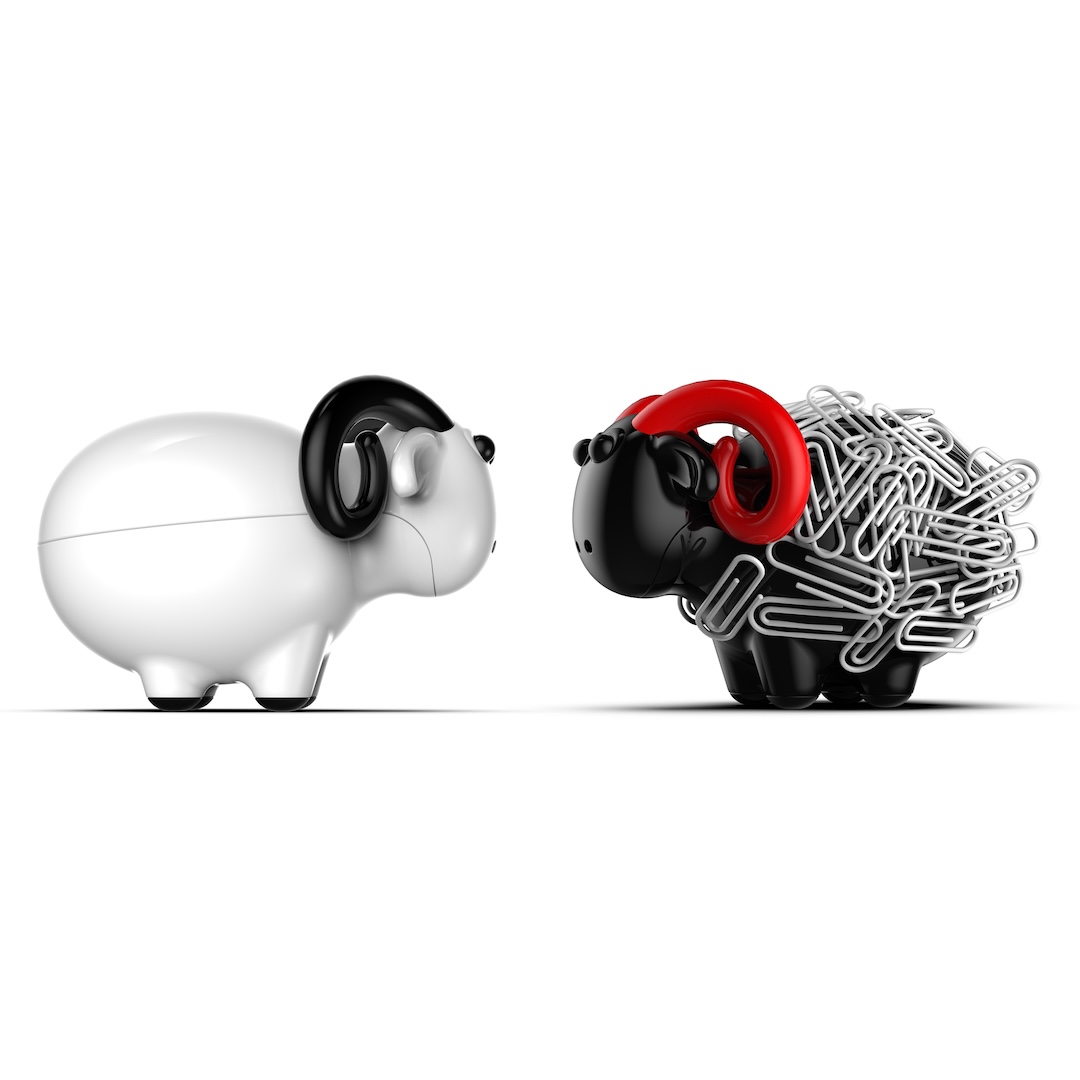
Ewe said what—a sheep with a coat made entirely of paper clips? Yes, it’s the playful premise behind Xin Se’s Shearing Magnetic Absorption, a desktop organizer that gives ordinary office supplies a woolly makeover. Inspired by the process of shearing sheep, the design uses a sheep-shaped magnetic holder to collect metal paper clips, making them appear like tufts of fleece.

Shearing Magnetic Absorption by Xin Se
The fun comes when it’s time to retrieve a clip. Removing one from the holder mimics the act of shearing, turning a mundane desk task into a small visual joke. Beyond its unusual appearance, the organizer keeps paper clips conveniently gathered in one place. It’s a simple example of how a familiar object can be given a little personality without losing its practical purpose.
Shearing Magnetic Absorption by Xin Se
Shearing Magnetic Absorption by Xin Se
Shearing Magnetic Absorption by Xin Se
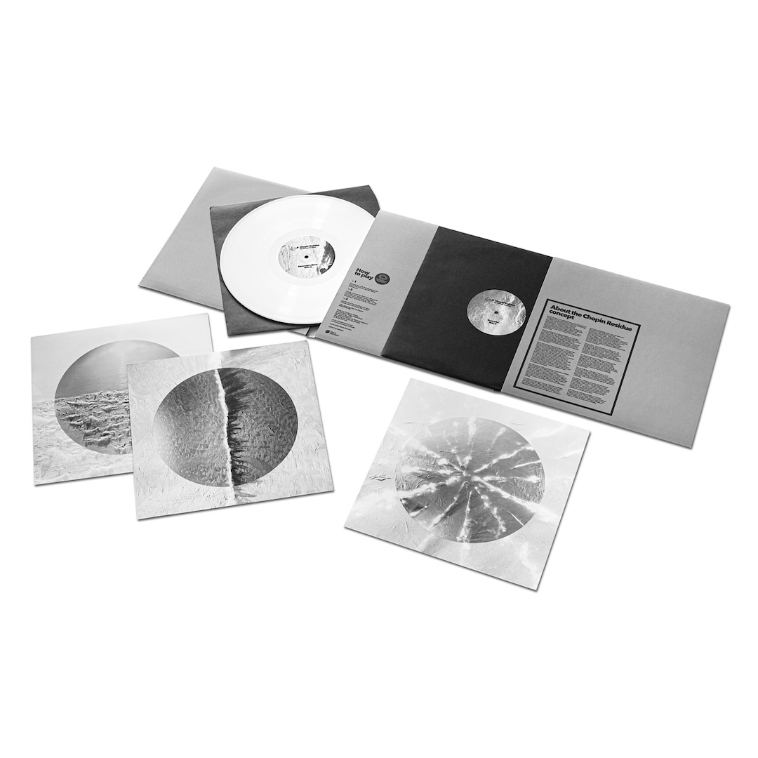
Chopin Residue Music Album Cover by Mariusz Szypura
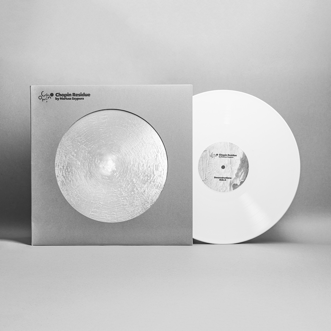
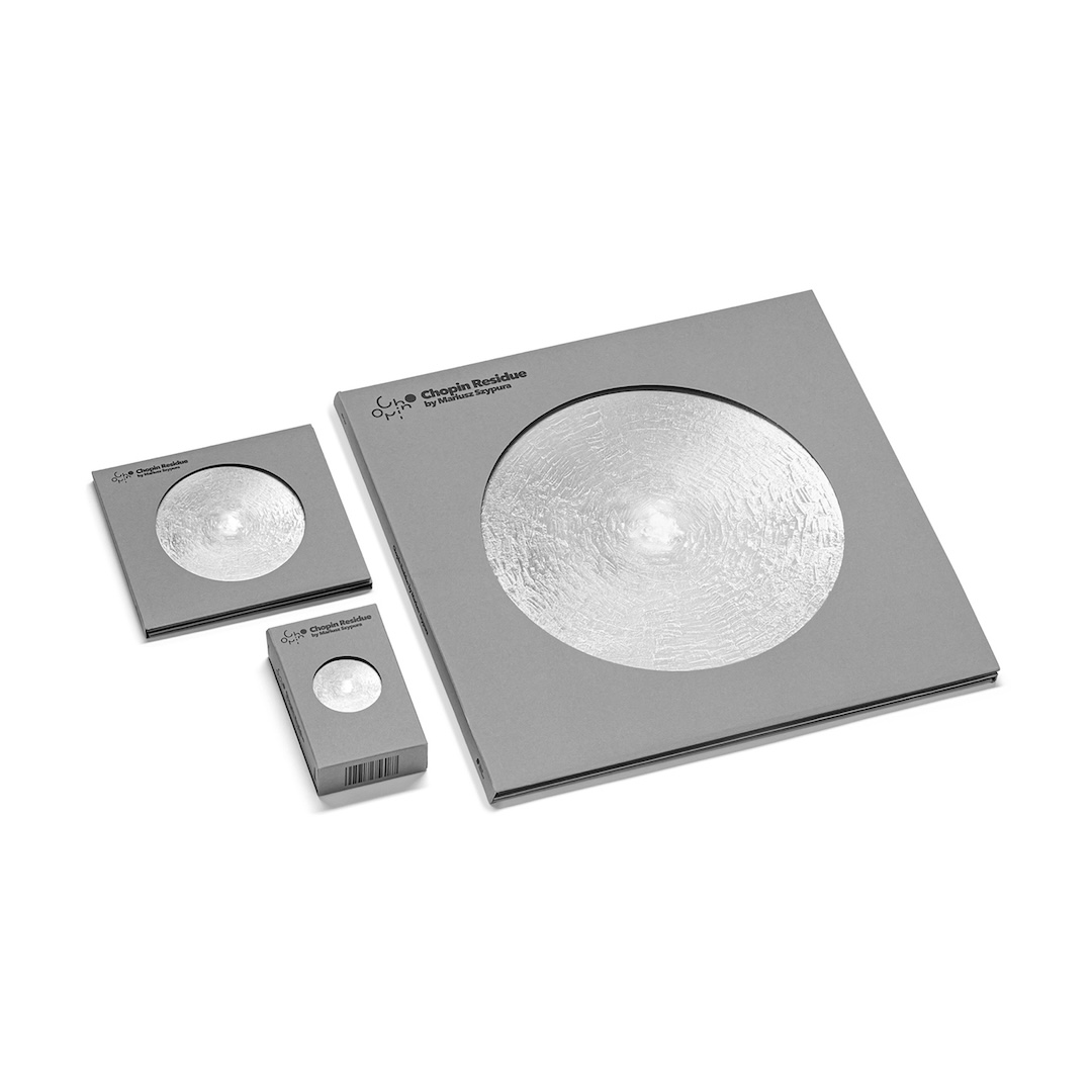
What happens to the material left behind when a vinyl record is made? For Mariusz Szypura, the leftovers became part of the artwork itself. His Chopin Residue album cover uses waste generated during the lathe-cut vinyl production process, connecting the physical act of making a record with its visual presentation. The concept reflects the album’s exploration of musical deconstruction and what remains after familiar compositions have been transformed.
Chopin Residue Music Album Cover by Mariusz Szypura
The record brings together reinterpretations of Fryderyk Chopin’s music involving artists associated with Portishead, Sonic Youth, Battles, Beck, David Bowie, and Tortoise. Rather than simply illustrating the music, the packaging incorporates traces of its production, creating a connection between sound and material. Handling the album reveals another dimension of the listening experience, where the artwork offers a tangible glimpse into how the record came to be.
Chopin Residue Music Album Cover by Mariusz Szypura
Chopin Residue Music Album Cover by Mariusz Szypura
Sostanza Lead Holder by Elastico Studio
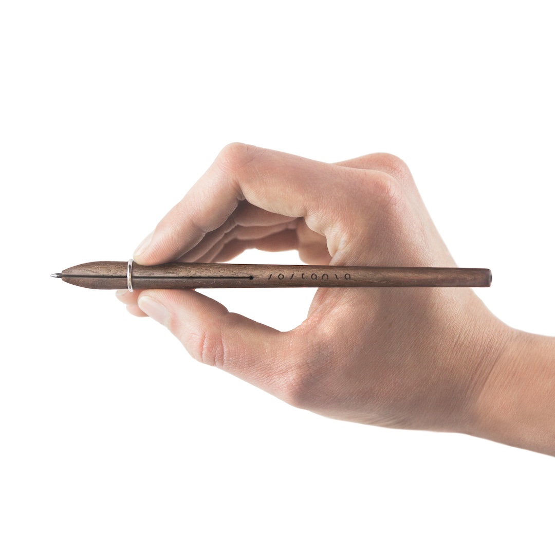
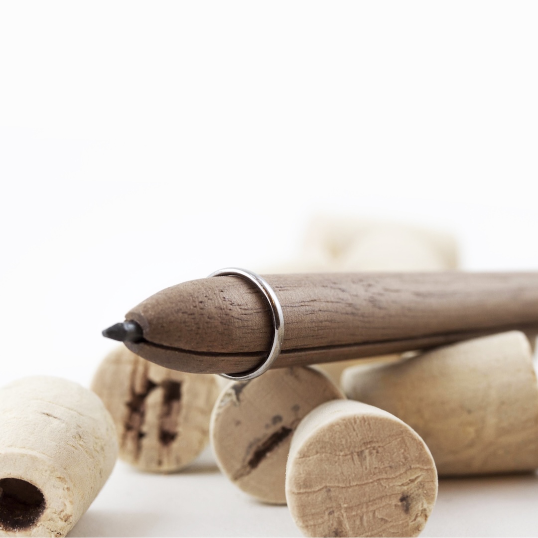
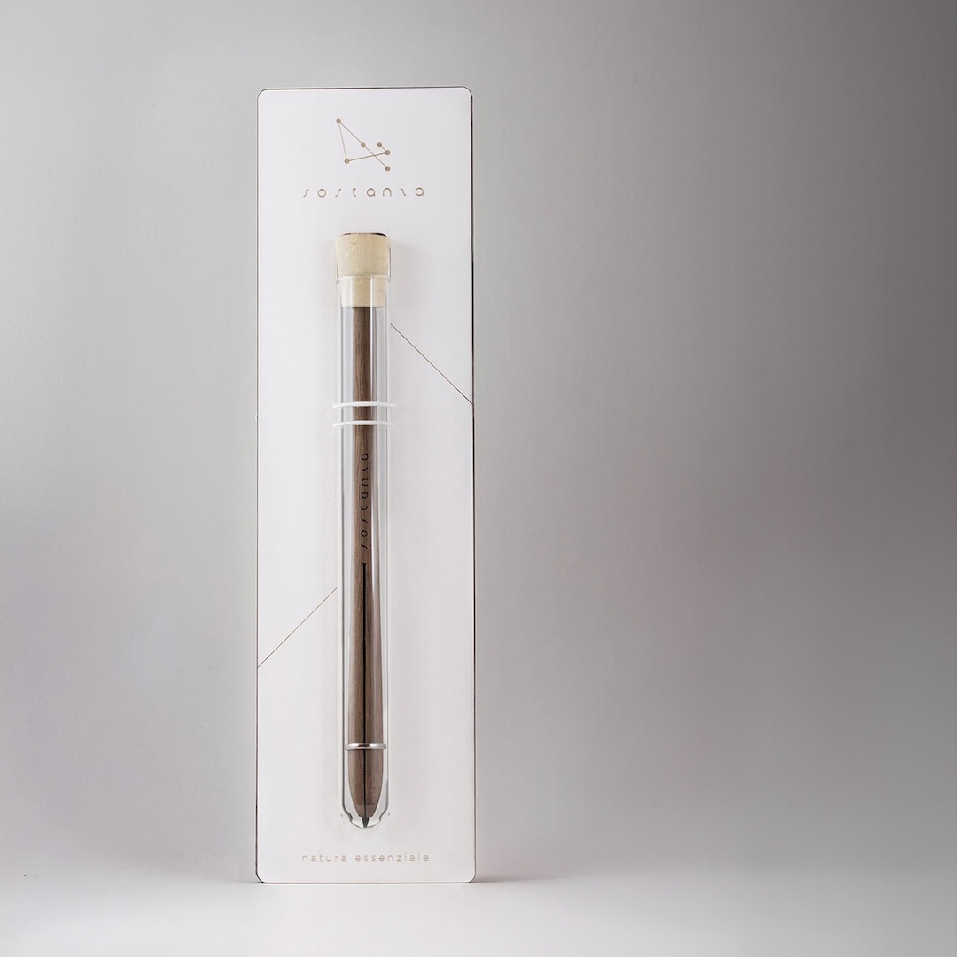
The humble pencil has a few drawbacks. Traditional wooden pencils gradually disappear with every sharpening, while mechanical versions can come with fiddly components and plastic bodies that don’t always feel comfortable to hold. Elastico Studio’s Sostanza takes a different approach, stripping the writing instrument down to just two main pieces.
Sostanza Lead Holder by Elastico Studio
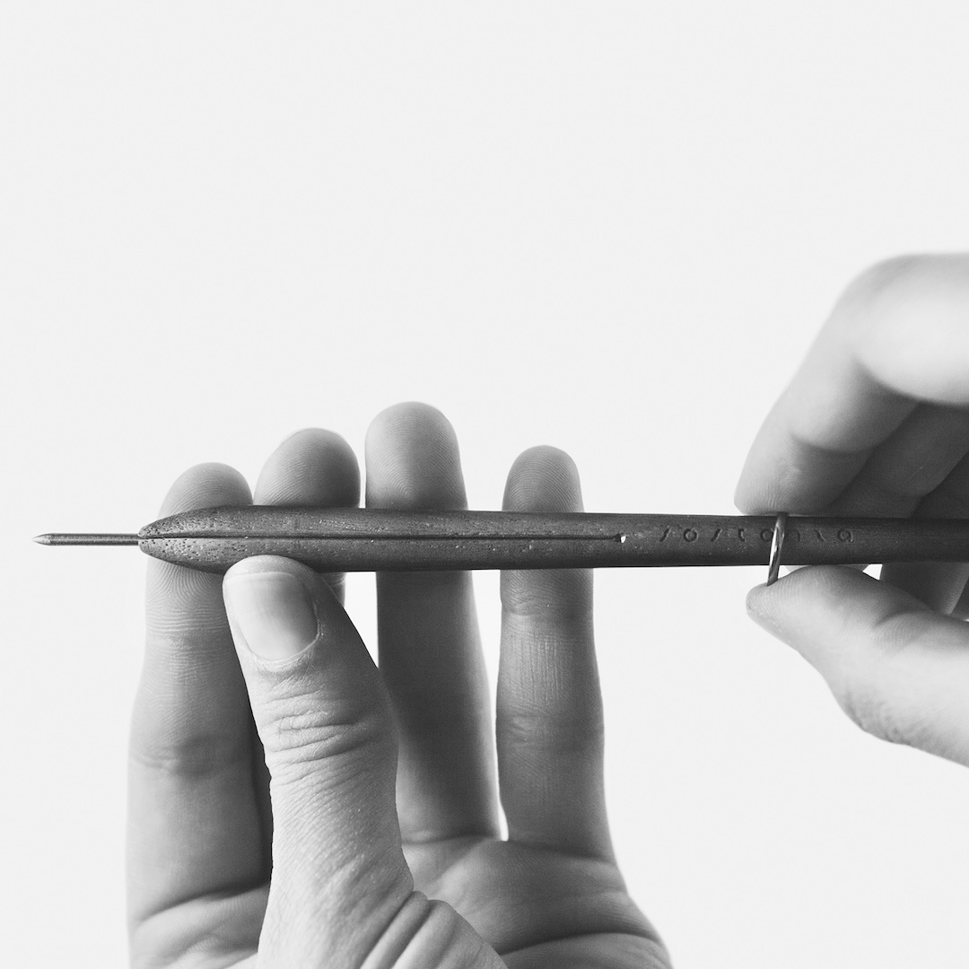
The design consists of a lightweight wooden body that holds a replaceable 2 mm graphite lead, secured by an outer ring that slides upward to lock it in position. Users can choose their preferred lead hardness and sharpen the tip with a conventional sharpener or sandpaper. With its simple construction and natural materials, Sostanza offers an alternative to disposable pencils and more complicated mechanical designs, putting the focus back on the familiar act of writing and drawing.
Sostanza Lead Holder by Elastico Studio
Sostanza Lead Holder by Elastico Studio
Sostanza Lead Holder by Elastico Studio
SideKick Notebook by Tan Mavitan
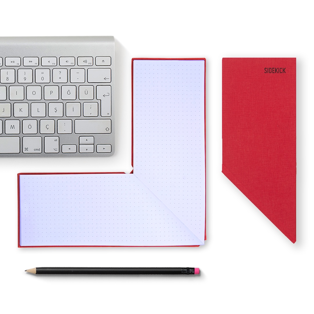
Even with laptops, tablets, and smartphones taking over our desks, there’s still something convenient about reaching for a pen and paper. The trouble is finding room for a notebook when your keyboard is already occupying most of the space. Tan Mavitan’s SideKick Notebook addresses this familiar problem with an unconventional shape that fits neatly around the corners of everyday devices.
SideKick Notebook by Tan Mavitan
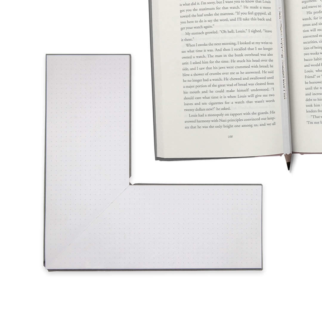
When opened, the notebook forms an L-shape, allowing it to wrap around the corner of a laptop, tablet, keyboard, or other rectangular object. This clever arrangement keeps a writing surface within reach without having to slide a notebook underneath a keyboard or place it awkwardly on top. It’s a simple adjustment to the traditional notebook format that makes handwritten notes and quick sketches easier to incorporate into a digital workspace.
SideKick Notebook by Tan Mavitan
Robot and Roboni Pencil Sharpener by HsinHung Chou – Carpenter Brother and Sister
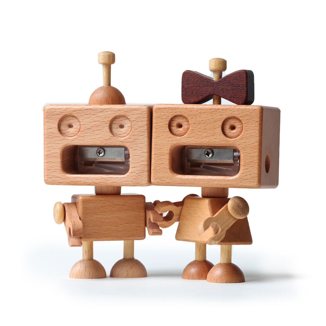
While pencil sharpeners aren’t usually known for their personalities, Robot and Roboni have a sharp little character to spare. Designed by HsinHung Chou of Carpenter Brother and Sister, the pair transforms a basic stationery tool into two cheerful desktop figures. Robot has a round, chubby appearance, while Roboni sports a skirt and bow, giving each sharpener its own distinctive look.
Robot And Roboni Pencil Sharpener by HsinHung Chou - Carpenter Brother and Sister
Their heads do more than complete their expressions. Both rotate a full 360 degrees, allowing users to sharpen pencils by inserting them into the opening and twisting the head clockwise. A removable bottom cover makes disposing of shavings straightforward. The designers wanted to bring a little enjoyment to routine desk activities, and the result gives pencil sharpening an amusing, hands-on twist.
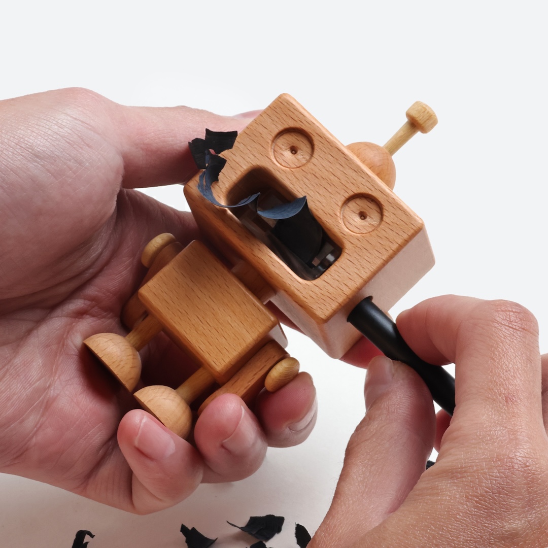
Robot And Roboni Pencil Sharpener by HsinHung Chou - Carpenter Brother and Sister
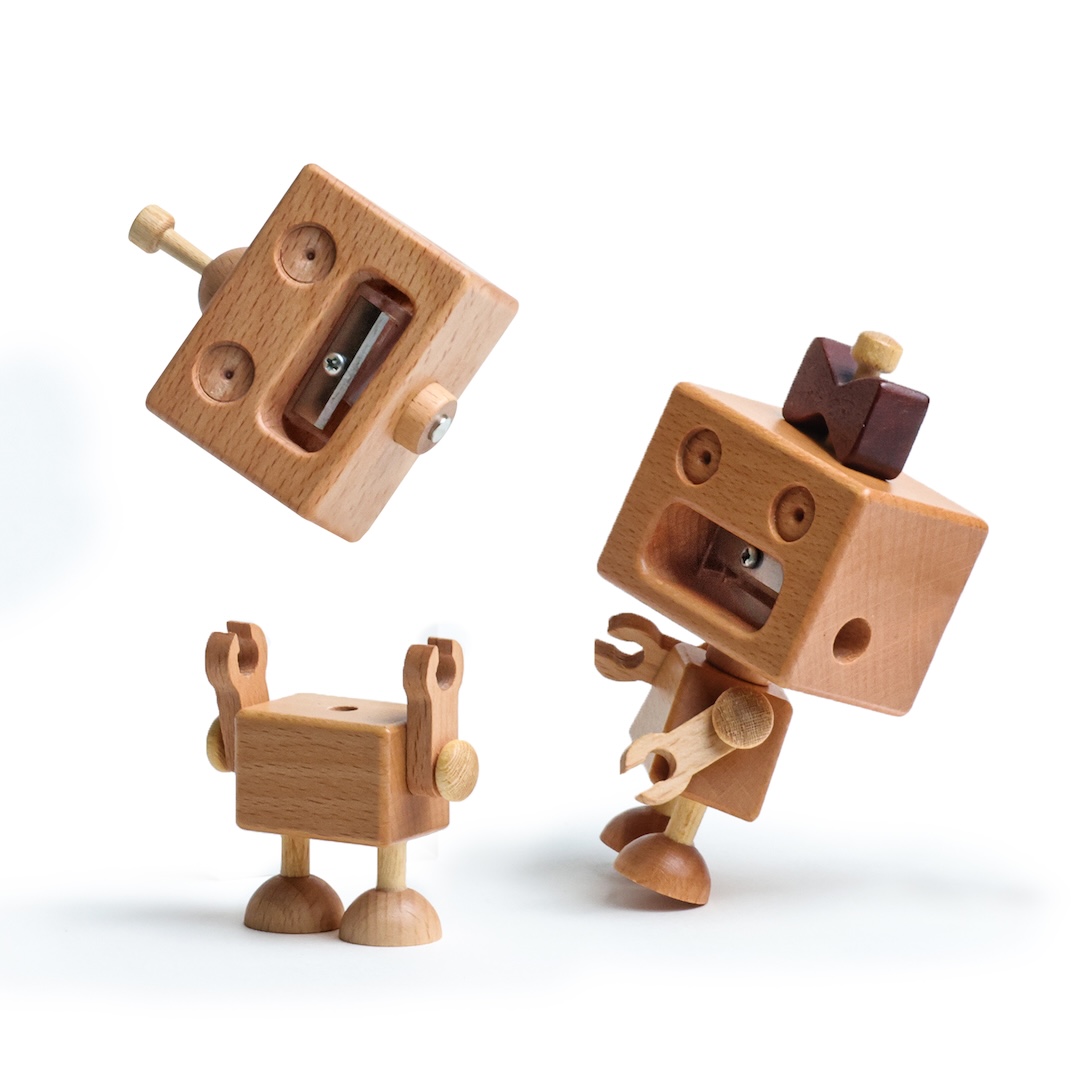
Robot And Roboni Pencil Sharpener by HsinHung Chou - Carpenter Brother and Sister
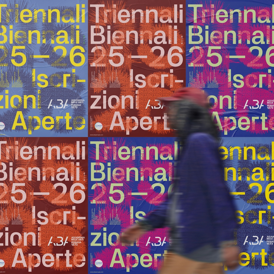
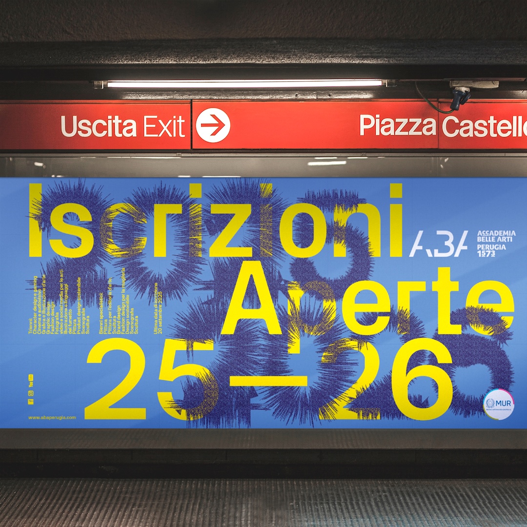
ABA Typographic Posters Advertising and AR Campaign by Paul Robb
Some posters are designed to be read and walked past. Paul Robb’s ABA Typographic Posters campaign wants viewers to stop, look, and take out their phones. Developed to promote an arts university, the project combines oversized, expressive typography with augmented reality (AR), using public spaces to introduce prospective students to the institution’s creative approach.
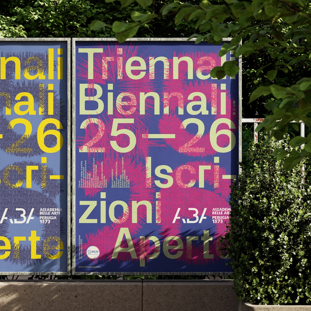
ABA Typographic Posters Advertising and AR Campaign by Paul Robb
At first glance, the posters work as bold graphic compositions, drawing attention through their experimental lettering. Scanning them with a mobile device, however, activates additional AR content that extends the visual experience beyond the printed surface. In making typography interactive, the campaign moves away from conventional university advertising and encourages viewers to explore the message rather than simply read it.
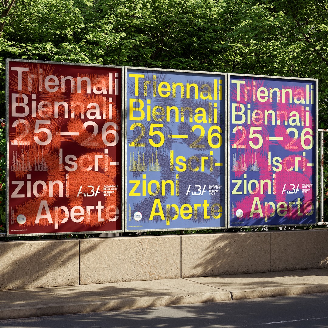
ABA Typographic Posters Advertising and AR Campaign by Paul Robb
ABA Typographic Posters Advertising and AR Campaign by Paul Robb
ABA Typographic Posters Advertising and AR Campaign by Paul Robb
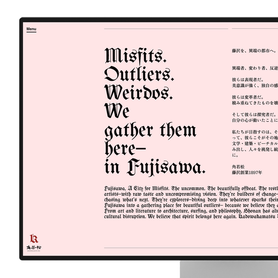
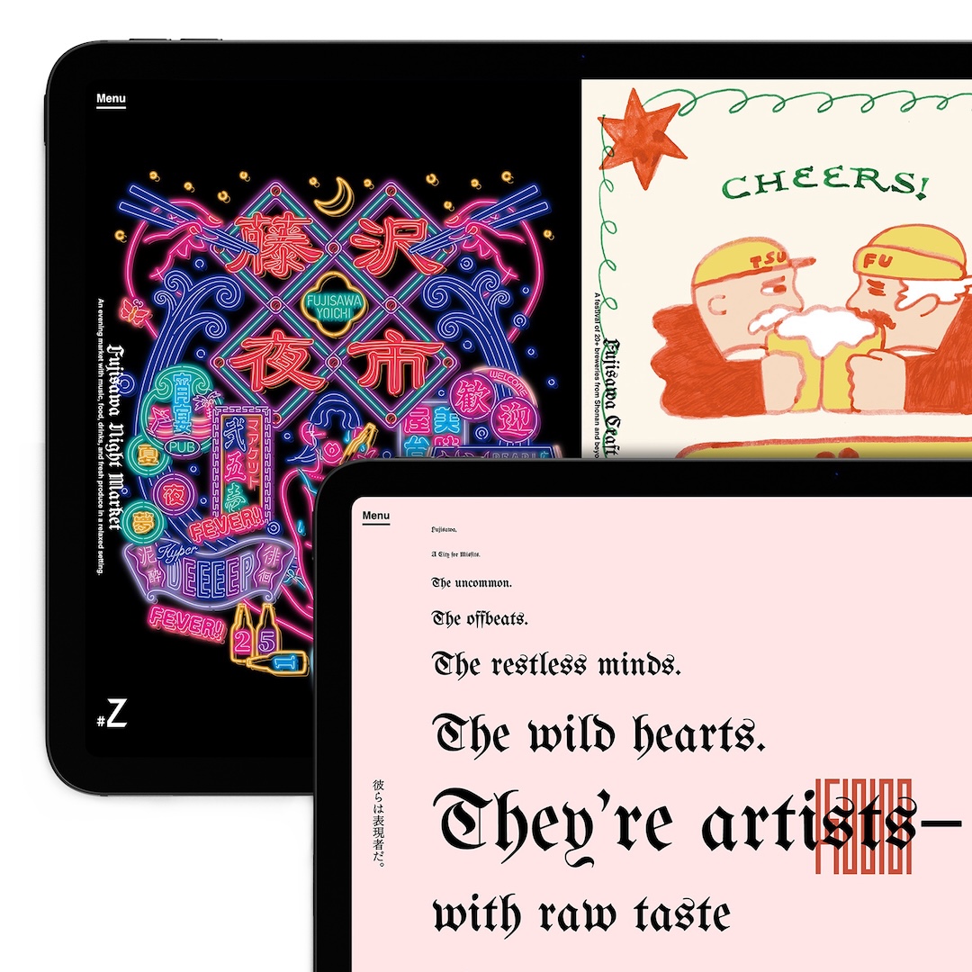
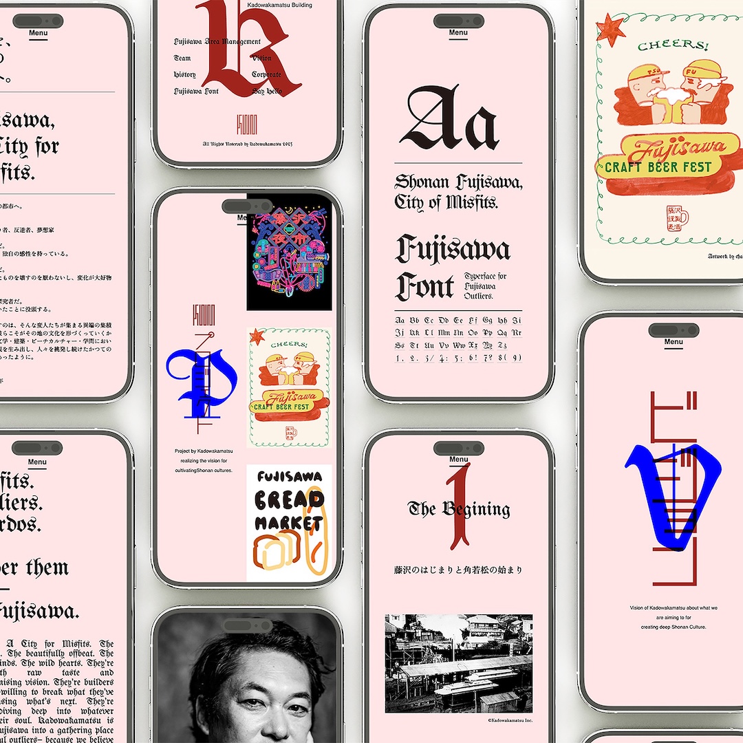
Kadowakamatsu Corporate Website by Tomohiro Kaji
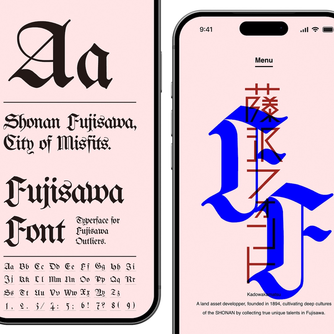
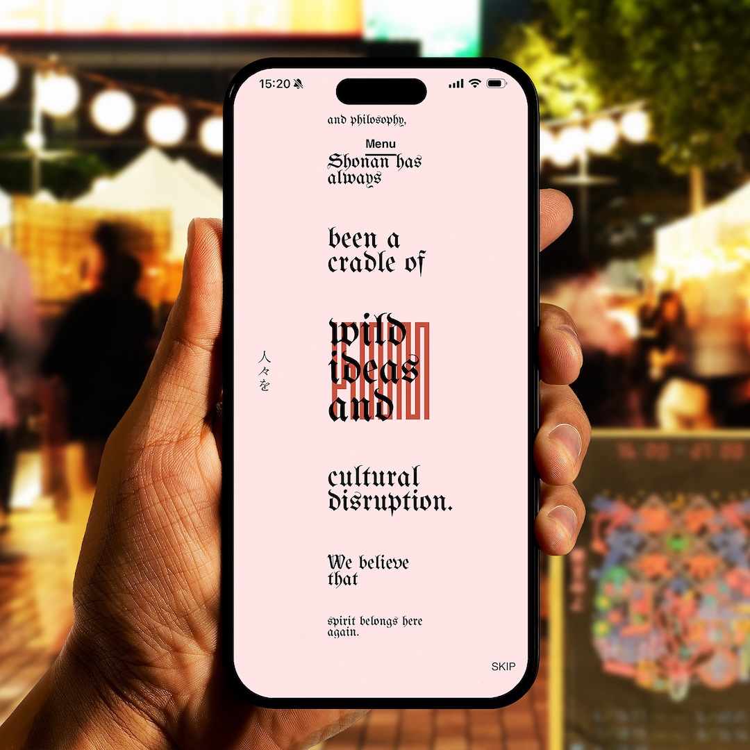
Real estate websites tend to focus on property listings, prices, and locations, but Tomohiro Kaji’s Kadowakamatsu takes a more cultural route. Created around the identity of Japan’s Shonan region, the corporate website explores how local character and history contribute to a place’s value. The project responds to concerns that suburban development and standardized property marketing can gradually make distinctive communities feel increasingly alike.
Kadowakamatsu Corporate Website by Tomohiro Kaji
Instead of relying on familiar real estate layouts, the website brings together a custom typeface, Japanese and Latin typography, and editorial-style compositions. Visitors navigate both vertically and horizontally, moving through sections dedicated to the company’s philosophy, projects, and background. The spacious layouts and unconventional browsing structure encourage a more considered look at the region, presenting property as part of a larger cultural story, and not just another listing.
Kadowakamatsu Corporate Website by Tomohiro Kaji
Kadowakamatsu Corporate Website by Tomohiro Kaji
Kadowakamatsu Corporate Website by Tomohiro Kaji
Kadowakamatsu Corporate Website by Tomohiro Kaji
Voice Print Book by Isabelle Tan
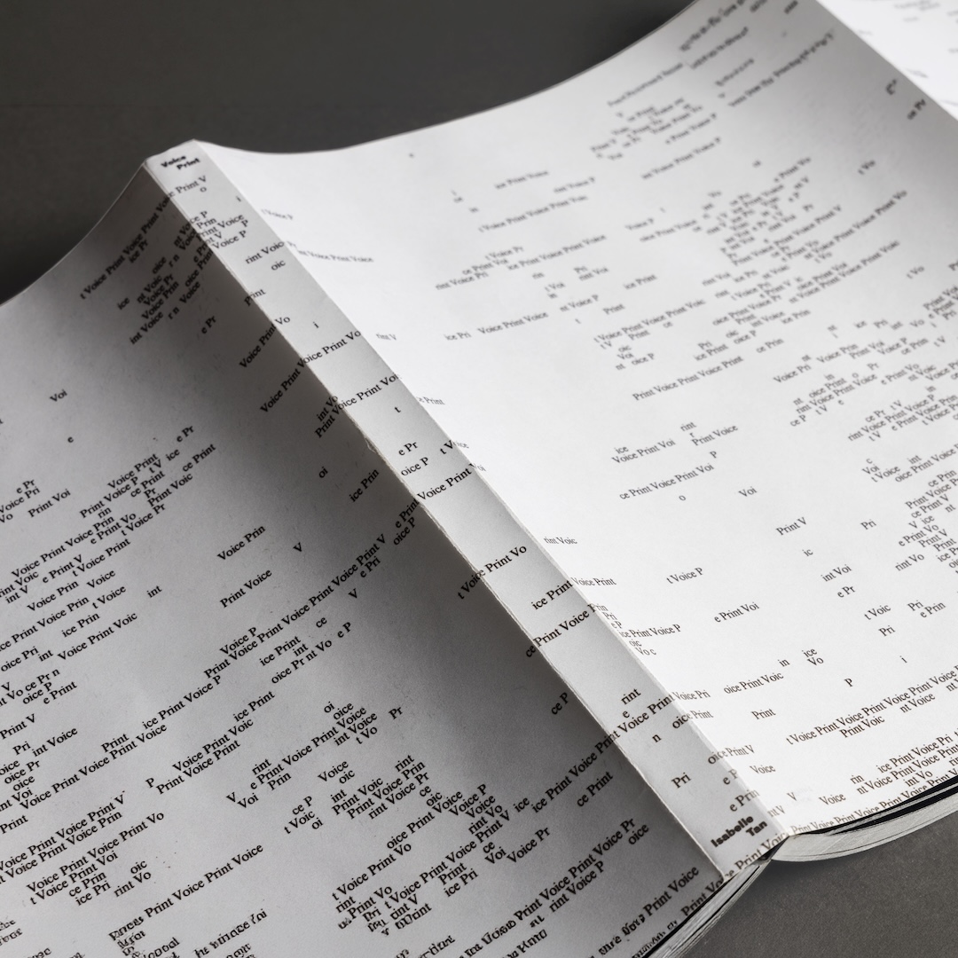
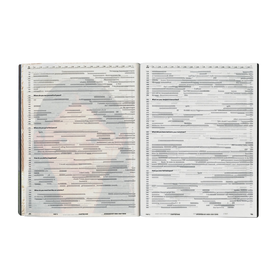
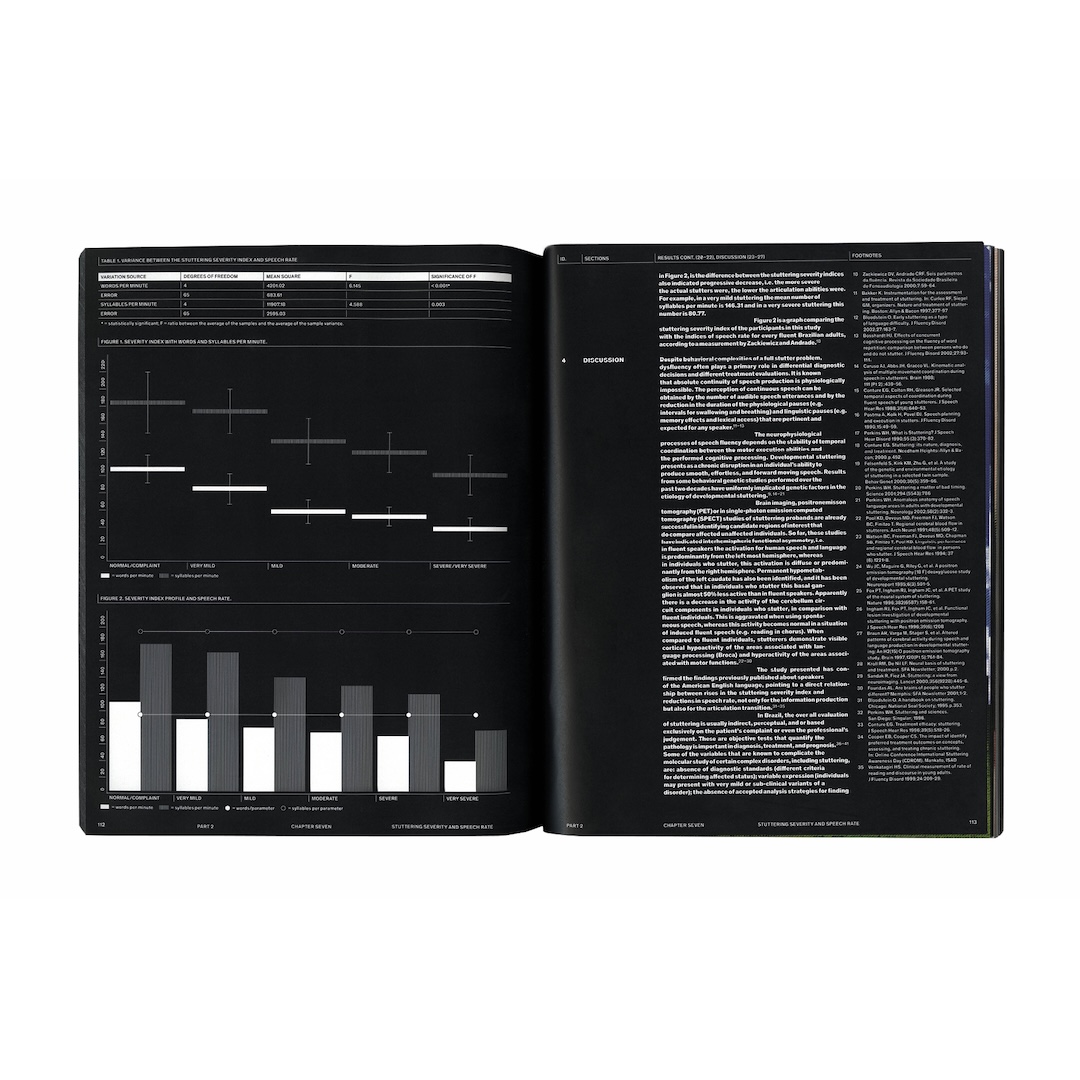
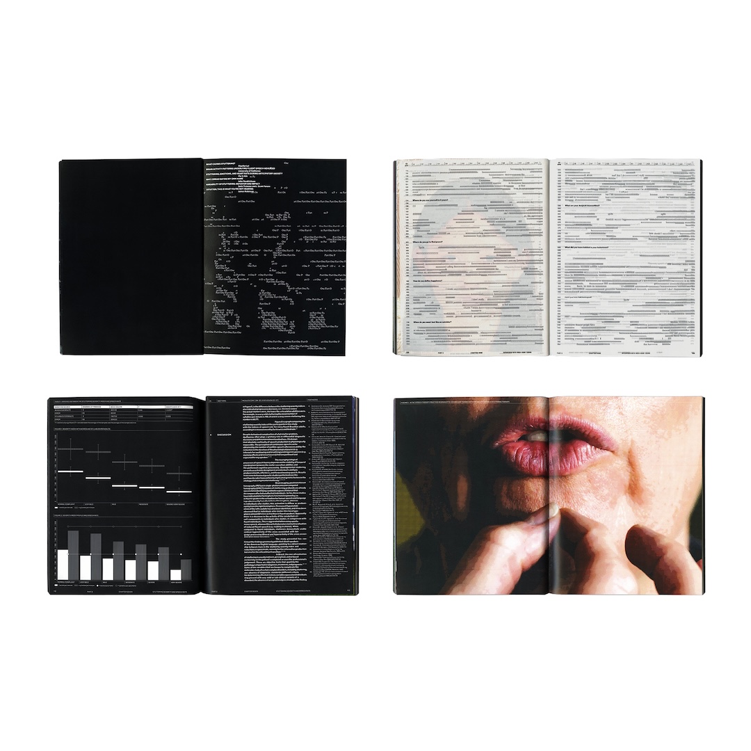
Speech rarely follows a perfectly straight line. There are pauses, repeated sounds, hesitations, and unexpected changes in rhythm, yet these natural variations are often treated as obstacles to fluency. Isabelle Tan’s Voice Print explores this perception by translating the irregularities of spoken language into visual compositions, challenging the assumption that fluent speech must always be smooth and uninterrupted.
Voice Print Book by Isabelle Tan
Inspired by musical notation, the book uses structured typographic grids to represent the timing and patterns of speech. These visual scores are accompanied by essays printed in white text against black backgrounds on glossy, opaque paper, creating a contrast between expressive speech patterns and orderly editorial layouts. Placing forms of speech such as stuttering and melismatic singing within the same visual framework, the project encourages readers to consider the many ways people communicate.
Voice Print Book by Isabelle Tan
Voice Print Book by Isabelle Tan
Voice Print Book by Isabelle Tan
Hoverpen Interstellar Ballpoint Pen by Novium
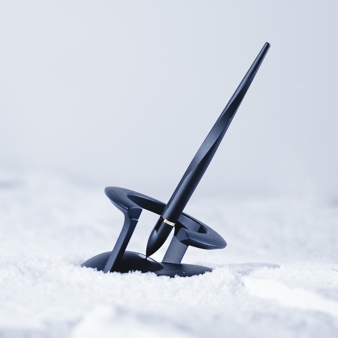
Who says a pen has to always stay grounded on paper? Novium’s Hoverpen Interstellar takes inspiration from spacecraft, science fiction, and humanity’s fascination with the cosmos to give an everyday writing instrument a gravity-defying twist. Designed to hover above its stand, the ballpoint pen doubles as a kinetic desktop object, bringing a little space-age curiosity to the working day.
Hoverpen Interstellar Ballpoint Pen by Novium
Its ridged body adds visual interest when the pen is set spinning, with a gentle twist keeping it in motion for up to 20 seconds. Watching it accelerate and gradually slow down offers a playful distraction between writing sessions. Beyond its floating appearance, the pen remains fully functional, using replaceable Schmidt ink cartridges that follow international refill standards. The writing tool combines a familiar everyday function with a little orbital entertainment.
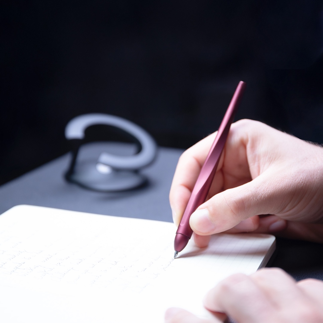
Hoverpen Interstellar Ballpoint Pen by Novium
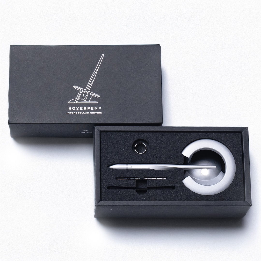
Hoverpen Interstellar Ballpoint Pen by Novium
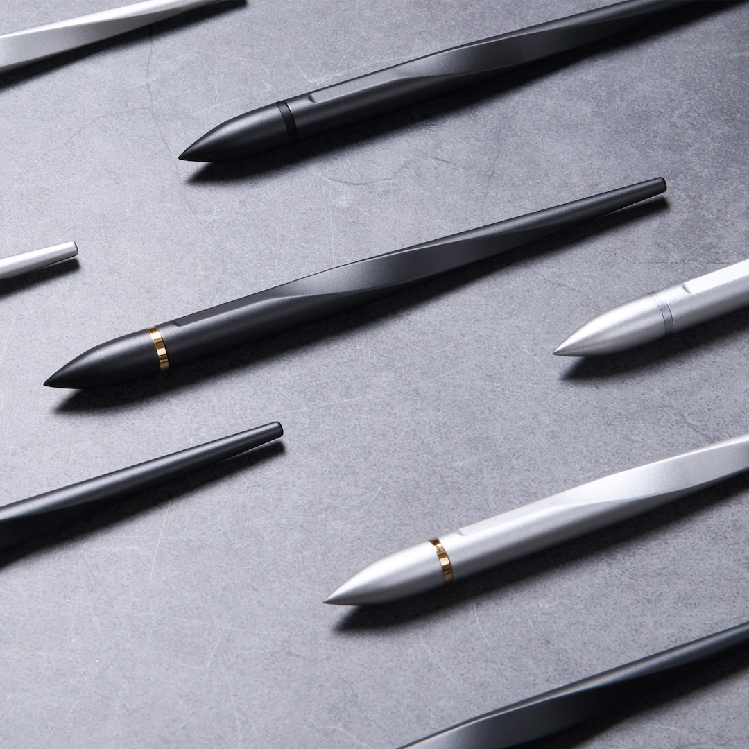
Hoverpen Interstellar Ballpoint Pen by Novium
As these award-winning projects show, effective communication design is about more than making something look good. It’s about finding the right visual language to tell a story, express an idea, or make information easier to understand. Some designs make their point with bold graphics and unexpected concepts, while others rely on subtle details that invite a closer look. Either way, the best ones give their audiences something to remember.
For designers, creative agencies, and brands with a project worth sharing, the next A’ Design Award offers an opportunity to have that work evaluated on an international stage. Entries close on February 28, 2027, and the winners will be revealed on May 1, 2027. Interested participants can register today to take part.
And if you’re looking for more creative inspiration, you can see more award-winning designs from across the competition’s many categories. Who knows? Your next big idea might be the one that gets everyone talking.
This is a sponsored post.


